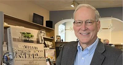
Communications director Kevyn Sutter | Photo courtesy Kevyn Sutter
Communications director Kevyn Sutter | Photo courtesy Kevyn Sutter
The Freeport City Council discussed a new city logo and brand design during its March 20 meeting.
City communications director Kevyn Sutter explained to council that city staff had been working on rebranding efforts over the past several months. The team had presented logo options to council during an earlier March meeting where the latter had made requests for design changes regarding improved readability and different color options. The two base designs are a Heart Pretzel logo and the Freeport leaf logo. The majority of city staff members preferred the latter base design for formal adoption.
In the more recent meeting, Sutter presented the top choice for a new logo: a bolder and more readable version of the Freeport leaf logo. According to her, the design was chosen due to its clarity and the ease of it blending into the official Freeport website without any redesigning. It would also present residents and visitors with a vibrant and sleek image to associate with the city.
"Several projects are on hold until a new brand identity is chosen, including the repainting of the water tower and signage at the new Birchwood Hills water treatment plant, which will be brought online in the summer," Sutter said. "So timelines are coming in short."
Council members asked Sutter questions about the logo, requesting a change in font color for the tagline, which may only be attached to the logo on special occasions, but all members preferred the new logo design to the originals presented earlier in the year. The Heart Pretzel wasn't chosen because officials felt that it wouldn't hold any meaning to residents or visitors who didn't grow up in Freeport's schools. Officials also felt that it wouldn't be different enough from the local school district's logo, as well as other nearby organizations with similar logo designs. Council ultimately voted 5-3 to adopt the Freeport leaf logo.


 Alerts Sign-up